24.4 Tornado diagrams outputs
This section will look at the outputs for the Tornado Diagram which was generated in the previous section. All the outputs below can be generated from the Tornado Dashboard.
Tornado Rankings
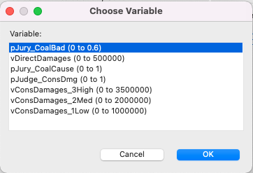
Click on the Rankings link and you will get the option to choose which variable you want to see in the one-way sensitivity analysis (as below).
This generates the same text report you get from One-Way Sensitivity Analysis Rankings described earlier.
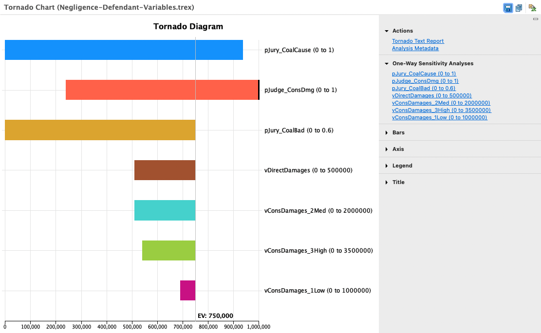
Incremental Value Tornado Graph
Click on the Incremental Value Chart button or the Incremental Value... link to open the Value Tornado Graph. You will be prompted to enter which Strategies to display. The Tornado Graph consists of a set of horizontal bars with each representing the impact on the Value of a specific input variable range.
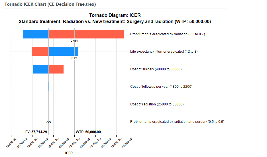
The widest bars at the top represent input ranges with the largest impact on Incremental Value.
Each bar is split by the EV line, which represents the base case where every input is at its best estimated value. For each bar, the blue portion represents the part of the input range from the lower bound to the base case value, while the red portion represents the part of the input range from the base case value to the upper bound. This allows you to immediately see which inputs increase vs. decrease the ICER.
This is reinforced by the default presentation of the input ranges numeric values in the legend.
Note the top bar indicates a threshold shown by the threshold input value. This is the input value where the Incremental Values changes from positive to negative, which indicates a change in the optimal strategy.
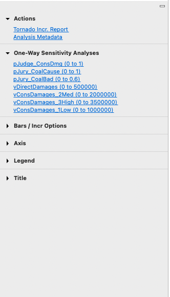
In addition to the main tornado graph, there are additional reports and graph display options to the right of the graph.
The Tornado Text Report provides a grid of numeric data related to the graph.
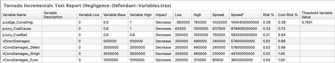
Each input/range is presented as a row in the report along with details on its range, base case, and possibly a threshold value.
The One-Way Sensitivity Analyses links generate a input value vs. Expected Value line for each input.
Graph display options are also available in the right-hand pane to the right of the Tornado diagram. These control the graph's display of bars, EV lines, thresholds and the legend.
Value Tornado Diagram
Click on the Cost... link to open the Value Tornado Graph. You will be prompted to choose between showing all strategies or a single strategy.
The graph above is for all strategies. Secondary links show the impact on value for each input range.
