8.6 Tornado
Tornado Analysis shows how results change over uncertainty ranges for inputs selected by the modeler. Each input's analysis range is run separately, then the results are presented in a consolidated set of graphs.
TPWeb supports three outputs from a Tornado Analysis and the Modeler chooses which ones are shared.
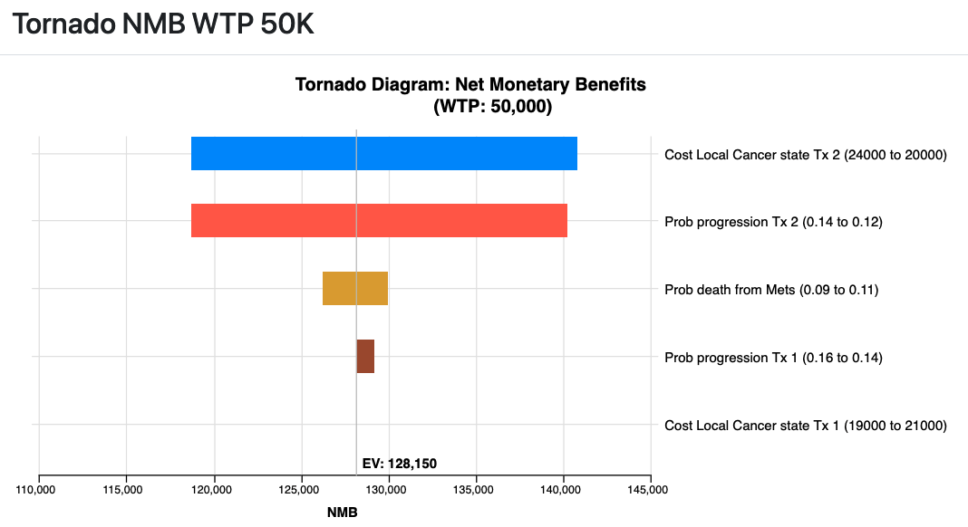
Tornado NMB Chart (Strategy)
The Net Monetary Benefit (NMB) Tornado analysis can be generated for each strategy in your model. This graph shows how the NMB for that strategy changes across the uncertainty ranges for each input. The input ranges are presented top to bottom based on their impact on the NMB.

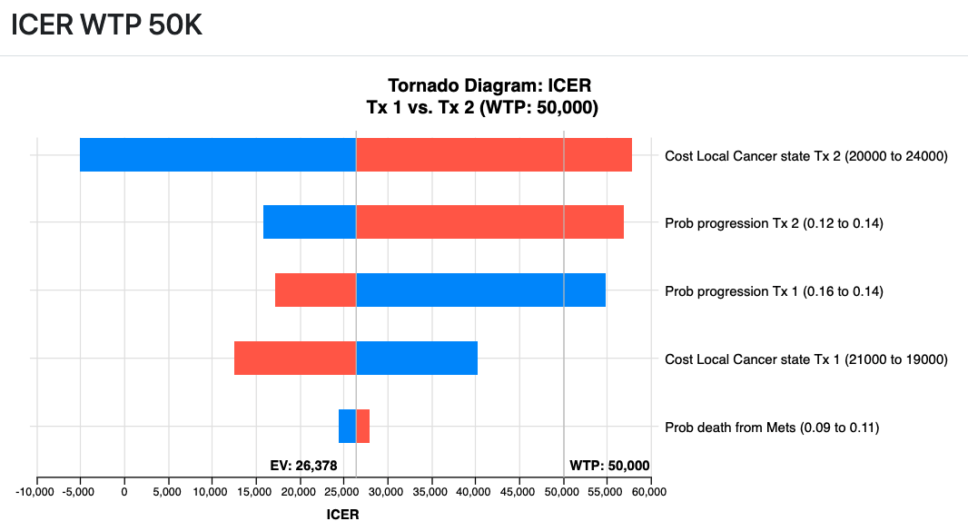
Tornado ICER Chart
The Incremental Cost Effectiveness Ratio (ICER) Tornado diagram centers on the baseline ICER. Then it presents a bar showing the impact of each parameter's uncertainty on the ICER. If the bar passes through the WTP, then there is a switch in the more cost-effective strategy.
If the uncertainty range includes a point where the incremental effectiveness of zero, this leads to an infinite range for the ICER, represented by an infinity sign.

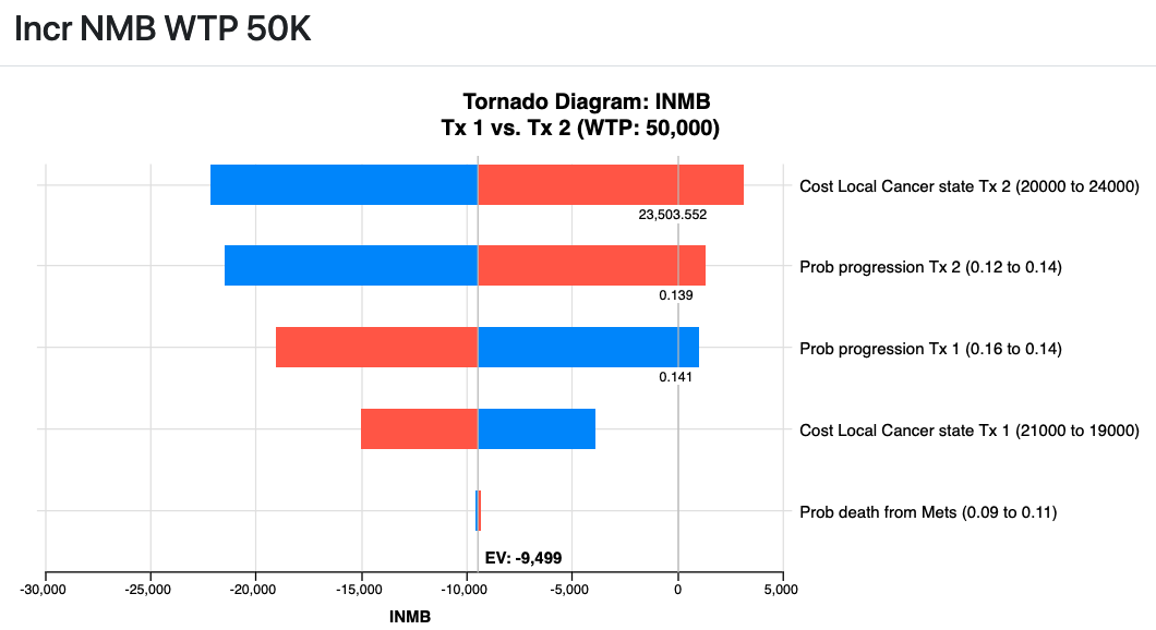
Tornado INMB Chart
The Incremental Net Monetary Benefit (INMB) Tornado diagram centers on the difference in INMB between two strategies. A positive INMB indicates that the comparator strategy is more cost-effective than the baseline strategy. Then it presents a bar showing the impact of each parameter's uncertainty on the INMB. If the bar passes through 0, then there is a switch in the more cost-effective strategy.

Modelers can also share access to 1-way sensitivity analysis graphs (ICER, INMB, NMB) if the modeler chooses to share those secondary analyses over the web.
