23.3 Batch Simulation
When you run a Monte Carlo Simulation, there are stochastic elements such that each iteration within the simulation yields different results. Typically, the interpretation of simulation results is based on aggregate data for the entire simulation run. For example, a patient simulation/Microsimulation model uses mean values from all simulated patients to estimate the expected values (EVs) in the model. However, if you run too few patients in the simulation run, the mean value may be unstable and may not yield accurate estimates of the model EVs.
By running a batch of simulations, you can look across all the runs within the batch to see if the results are stable. If they are, then you can reasonably assume that the mean values from any single run are accurate. If the results are not stable, then you likely need to increase the number if iterations in the simulation to generate more accurate EV estimates.
In this section, we will examine the results from a Microsimulation Batch to determine the stability of the results. We will use the same Healthcare tutorial example MiicrosimulationCancerModel - Distributions.trex that is used in the Patient Simulation chapter.
Note that this section focuses on a Microsimulation model; however, the output would look similar for PSA and other simulation analysis batches.
To run the Microsimulation Batch:
-
Open Healthcare example model MicrosimulationCancerModel - Distributions.trex.
-
Select the root node.
-
Choose Analysis > Monte Carlo Simulation > Run Simulation Batch from the menu.
-
Choose Trials.
-
Enter 10 for the number of simulations in the batch.
-
Use the default number 10,000 as the number of trials within each Microsimulation run.
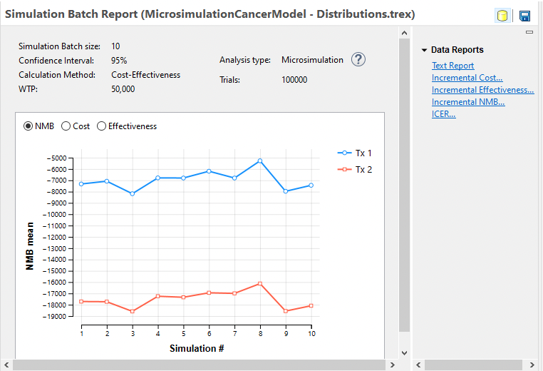
The batch simulation process will then run 10 individual Microsimulation runs, each with 10,000 patients. Note that seeding will be temporarily turned off for the batch simulations, so all runs within the batch are different. Seeding is turned back on after the batch is complete.
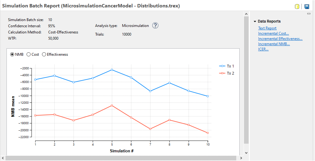
The Microsimulation Batch Dashboard presents an overview of the results from the individual Microsimulation runs. Note that the NMB from run to run changed significantly although the relative NMB of the two strategies remained relatively stable. Choose the other primary outputs Cost and Effectiveness to see how they vary from run to run.
Data Reports to the right of the dashboard provide additional insight into the stability of the simulation results.
-
Text Report - raw data from the simulation runs.
-
Incremental Cost - graph showing incremental cost between any comparator strategy and baseline strategy.
-
Incremental Effectiveness - graph showing incremental effectiveness between any comparator strategy and baseline strategy.
-
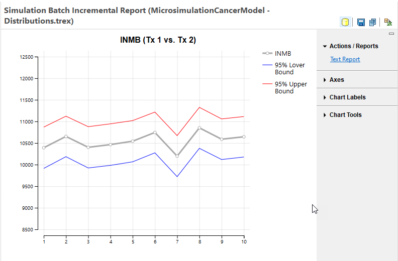
Incremental NMB - graph showing incremental NMB between any comparator strategy and baseline strategy.
-
ICER - graph showing ICER between any comparator strategy and baseline strategy.
Let's examine the Incremental NMB graph from this simulation batch - with Tx 1 as the comparator since that is the optimal strategy.

The main gray line in the graph represents the INMB mean values from the runs within the batch. Note that all runs have a positive INMB value demonstrating that all the runs within the batch confirm Tx 1 as the optimal strategy. The blue and red lines represent the lower and upper 95% prediction interval values for the means from each run.
The ICER mean value graph is presented below.
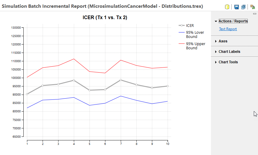
The main gray line in the graph represents the ICER mean values from the runs within the batch. Note that all runs have an ICER above the 50K WTP demonstrating that all the runs within the batch confirm Tx 1 as the optimal strategy. The blue and red lines represent the lower and upper 95% prediction interval values for the means from each run.
Note that the ICER mean and preditional interval data are derived from INMB statistics rather that raw ICER statistics with methods published by Hatswell et al. This method is used because it produces more robust statistics since ICER is a ratio of model outputs. This avoids overstating ICER instability in cases where the denominator IE is close to or crosses 0.
The Incremental Cost and Incremental Effectiveness graphs look very similar.
Note that if we run the same batch analysis, but with 100,000 trials within each simulation, the mean values are more stable.