28.8 Customizing Histograms
There are also some options for customizing graphs which are specific to a histogram. We will refer to probability distribution graphs as histograms throughout the Help files but we can use these terms interchangeably.
All histograms group data together and then divide the total range into a number of bars. By default, TreeAge Pro creates bars that start/stop on regular intervals (e.g., 100K, 200K, etc.) with an assumed default of 20 bars. The number of bars will increase/decrease based on the actual data being reported. You can override the default settings to customize the presentation data via a dialog that opens when you first generate a histogram, or when you click the "Redo Histogram" link to the right of the graph.
We will use the Special Features Example model Distributions.trex to demonstrate these options. This "model" does nothing except generate the distributions when we run Probabilistic Sensitivity Analysis - its not a model you would perform analysis on.
Generate histogram of distribution samples
-
Open the Distributions view.
-
Select the first distribution Dist_Normal.
-
In the toolbar for the Distributions view click the "Graph It" icon.
-
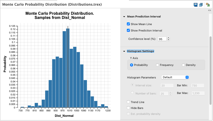
Click "OK" to use the default number of samples and generate the graph below.

By default, histograms include mean and prediction interval data. The single line near 1000 represents the mean value for the histogram. The shaded region around the mean represents the 95% prediction interval around the mean - meaning the true mean is 95% likely to be within the shaded area. Repeating the "Graph It" process with more samples would generate a tighter prediction interval since more samples provides more confidence in the mean value.
Mean Prediction Interval Settings
These settings to the right of the graph allow you to show/hide the mean line and/or the prediction interval.
You can also change the desired confidence level percentage from the common default value of 95%. Increasing the confidence level generates a wider range for the prediction interval shaded area in the graph. Higher confidence levels require a larger range to increase the probability that a true mean is within that range.
The confidence level percentage is used the same as would be used to derive a confidence interval from clinical data. Statisticians, distinguish terminology of prediction intervals and confidence intervals, while using the same mathematical formulas. Prediction Interval describes mean behavior of simulated results, while Confidence Interval describes mean behavior of observed physical results.
Histogram Settings
To customize the Histogram use the Histogram Settings to the right.
-
Y Axis: Change the axis metric to either Probability, Frequency or Density.
-
Probability: the percentage of values contained within the bar.
-
Frequency: the number of values contained within the bar.
-
Density: the density within the bar (probability/bar width).
-
-
Histogram parameters: Use the Default parameters or Custom. See description below for details of the Custom options by either Interval Size or by Number of Bars.
-
Trend line: Check box to add the trend line.
-
Est. probability density: estimated probability density.
Histogram parameters
-
Custom Interval Size. This will set the size of the interval of each bar.
-
Custom Number of Bars. The bar width will be generated according to the number of bars entered here taking into account the Bar Max and Bar Min.
-
Bar Min. Change this value from the default to the required minimum bar value.
-
Bar Max. Change this value from the default to the required maximum bar value.
-
Trend Line. Select this box to add a trend line to the histogram. To remove, select to redo the histrogram and un-select.
Histogram Text Reports
From any histogram, you can generate three text reports.
-
Text Report (bars) - provides the start, end and height of each bar.
-
Text Report (raw) - provides all data used to generate the histogram.
-
Stats Report - provides aggregated statistics on the histogram data (mean, standard deviation, etc.).
