31.2 Outputs of One-Way Sensitivity Analysis CE models
One-Way CE Rankings
The Actions > Rankings link and the Rankings Text Report button generate a text report with a series of rankings, one for each input value within the range for one-way sensitivity analysis.
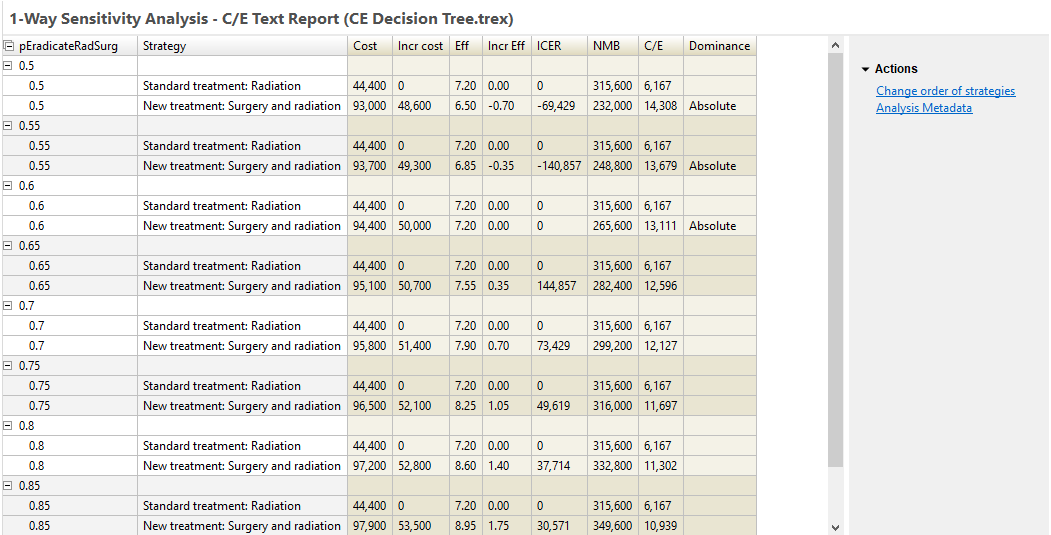
For each input value, you see the Rankings analysis from the model analysis. Note that for this specific input example, the results change for the second strategy, but not for the first. This mirrors the cost-effectiveness rankings output from cost-effectiveness analysis for that input value.
The NMB column is calculated using the WTP entered in Tree Preferences. The strategy with the highest NMB is the optimal strategy at that input value. The Dominance column identifies whether a strategy is dominated (absolute or extended).
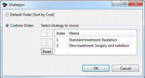
Note that strategies are sorted within each grouping based on cost by default. The Radiation strategy is the least costly for all calculations in this example, so that is listed first followed by the Surgery and Radiation strategy. However, this may not always be the case. You might choose to override the default sort via the option "Change order of strategies" to the right of the report. In the case where the cost of the strategies changes, this option would allow you to maintain the order of strategies regardless of which was the least costly.
The text report (default or custom sort) can also be exported to Excel using the "Open in New Excel Spreadsheet" icon to the far right of the report toolbar. There are two export options - one showing each strategy in its own row and one showing all strategies in the same row.
One-Way CE ICER Graph
The sensitivity analysis ICER graph demonstrates how the relative cost-effectiveness for a pair of strategies changes as the parameter value changes.
To open the sensitivity ICER graph:
-
Click the "ICER (Thresholds)" link or the "ICER for 2 strategies" button.
-
In the prompt, enter the Willingness-to-pay as 50000.
-
Leave "Hide baseline" checked.
-
Click OK.
Note that if your model has more than 2 strategies, you will have the option to pick a pair of strategies for the ICER graph.
The following graph is generated for this example model.
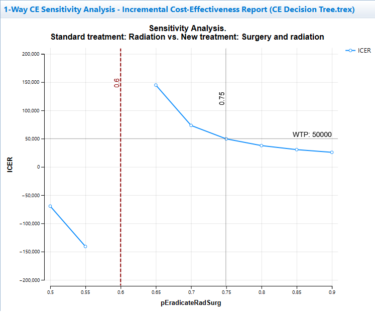
The graph shows how the ICER changes across the parameter's uncertainty range. The graph includes a cost-effectiveness threshold at input value 0.75 where the ICER is equal to the WTP. This is the point where the optimal strategy changes.
The vertical dashed line at input value 0.6 indicates an ICER asymptote because the incremental effectiveness is 0, so the ICER cannot be calculated.
Note that the cost-effectiveness threshold is estimated using interpolation between model calculations. Since this is generated from a different outcome (ICER), it could identify a slightly different threshold value than the Net Benifits graph in the subsequent section. By adding more intervals, the thresholds from the two methods will converge.
There are a few graph controls specific to the input vs. ICER graph.
-
Actions/Reports > Change Strategy Settings: provides the option to hide/show baseline strategy.
-
Sensitivity ICER Options: provides options to change WTP, hide/show asymptotes and change numeric formatting.
One-Way CE Net Benefits Graph
The sensitivity analysis Net Benefits graph demonstrates how the NMB of all strategies changes as the parameter value changes. This may be the easiest way to see CE thresholds when the optimal strategy changes.
Net Benefits calculations combine cost, effectiveness and willingness-to-pay into a single value (NMB = Eff * WTP - Cost). The strategy with the highest Net Benefits is optimal for that fixed WTP, so the graph clearly shows CE thresholds where the strategy with the highest NMB changes. This graph is often preferable to the ICER graph because it will have no asymptotes and because it better handles more than two strategies.
To open the sensitivity Net Benefits graph:
-
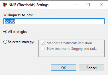
Click the NMB (Thresholds) link.
-
In the prompt, enter the Willingness-to-pay as 50000.
-
Leave All Strategies selected (as per the figure below).
-
Click OK.
A line graph will plot the NMB values for each strategy at the given WTP.
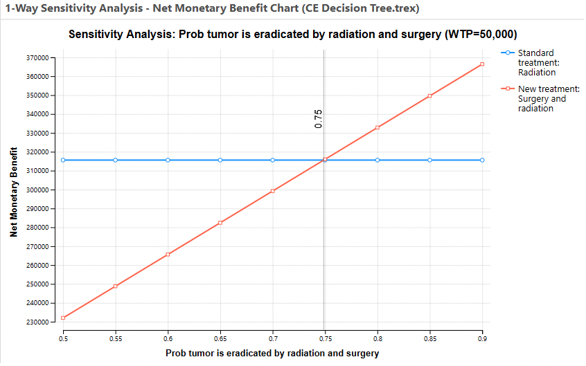
Note the variable parameter selected - pEradicateRadSurg - increases the NMB for the Surgery and Radiation Treatment Strategy, but it has no impact on the Radiation Treatment Strategy. At the estimated value of 0.75, the Surgery and Radiation treatment becomes the more cost-effective strategy (highest NMB).
If there were thresholds where one strategy's line crossed another, the Thresholds Report (link to right of graph) shows each threshold in the graph in a text format. Below is an example Thresholds Report for pEradicateRadSurg over the range 0.5 to 0.9 to demonstrate thresholds which could occur.
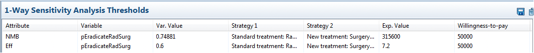
Thresholds are identified through linear interpolation. Thresholds can usually be identified more accurately by increasing the number of intervals in the original sensitivity analysis.
Several other sensitivity analysis graphs also have a supporting Thresholds Report. They all function in the same way - identifying the points where the maximum (or minimum for cost) value is represented by a change in strategy.
One-Way CE Incremental Net Benefits Graph
The sensitivity analysis INMB graph demonstrates how the INMB between two strategies changes as the parameter value changes. Typically, you would pick the base case optimal strategy as the comparator and another strategy as the baseline, so the base case INMB is greater than 0.
To open the sensitivity INMB graph:
-
Click the Incremental NMB link.
-
In the prompt, enter the Willingness-to-pay as 50000.
-
Choose New Treatment as the comparator. Standard Treatment will automatically be selected as the baseline.
-
Click OK.

In the graph above, the point where INMB passes through 0 (value 0.75) represents a cost-effectiveness threshold.
One-Way CE Cost and Incremental Cost Graphs
The sensitivity analysis Cost and Incremental Cost graphs allow you to focus specifically on cost within a cost-effectiveness model.
The cost graph can be run for all strategies or a single strategy.
The incremental cost graph can be run for any pair of strategies.
One-Way CE Effectiveness and Incremental Effectiveness Graphs
The sensitivity analysis Effectiveness and Incremental Effectiveness graphs allow you to focus specifically on effectiveness within a cost-effectiveness model.
The effectiveness graph can be run for all strategies or a single strategy.
The incremental effectiveness graph can be run for any pair of strategies.
One-Way CE Animated C/E Graph
The Cost-Effectiveness (animated) graph show the cost-effectiveness analysis graph for every value of the variable.
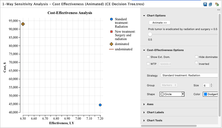
Each frame shows the CE graph for one iteration of the sensitivity analysis. Pressing the Animate buttons, or using the slider, causes TreeAge Pro to step through each value of the sensitivity analysis variable.
One-Way CE Average C/E Graph
The sensitivity analysis Average Cost-Effectiveness Graph shows how each strategy's cost/eff ratio changes with the input value.
This graph is rarely used because standard cost-effectiveness analysis is performed on incremental cost and incremental effectiveness rather than average cost and average effectiveness values.
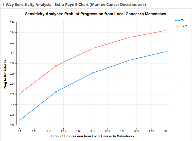
One-Way CE Extra Payoffs
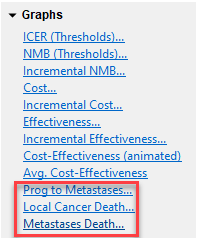
If your model includes additional enabled payoffs beyond the primary cost and effectiveness payoffs, you can generate graphs for how those payoffs change with the input parameter range.
The Health Care tutorial example model "Markov Cancer Decision.trex" includes extra payoffs. Running one-way sensitivity analysis on this model provides (pLocalToMetastases, 0.1-0.2, 4 intervals), and you will see additional graphs for each of the three extra payoffs - highlighted in the image below.
Click on the Prog to Metastases link to see how that payoff changes within the sensitivity analysis range as in the graph below.