31.4 Tornado diagrams outputs for CE models
This section will look at the outputs for the Tornado Diagram which was generated in the previous section. All the outputs below can be generated from the Tornado Dashboard.
CE Tornado Rankings
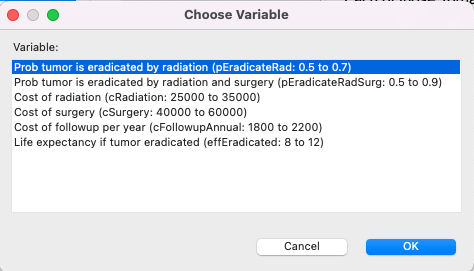
Click on the Rankings link and you will get the option to choose which variable you want to see the one-way sensitivity analysis for (as below).
This generates the same text report you get from One-Way Sensitivity Analysis Rankings described earlier.
CE ICER Tornado Graph
Click on the ICER Chart button or the ICER... link to open the CE ICER Tornado Graph. You will be prompted for a WTP (default from Tree Preferences). You will also be prompted to choose a pair of strategies if the analysis includes more than two.
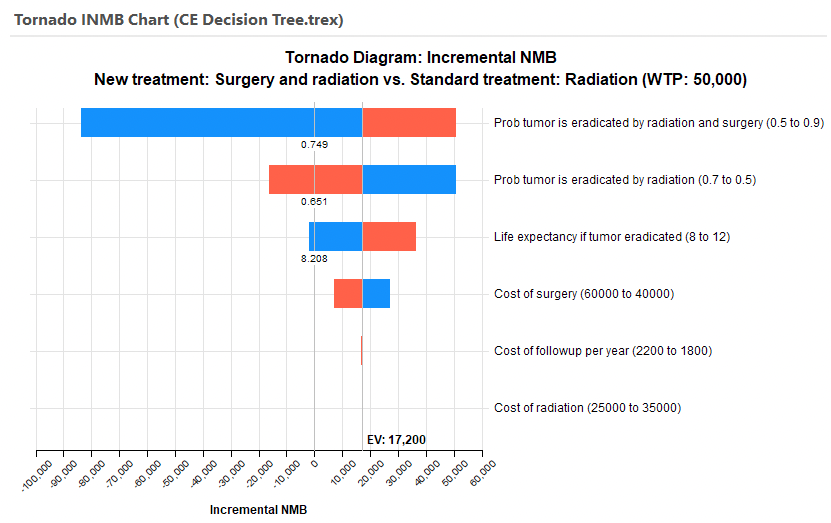
The CE ICER Tornado Graph consists of a set of horizontal bars with each representing the impact on ICER of a specific input variable range.
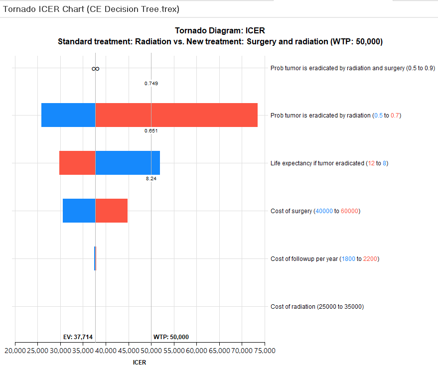
The bars are ordered so those at the top represent input ranges with the largest impact on ICER. Note that the "probability tumor is eradicated by radiation and surgery" had an infinite range of ICER, so this is shown at the top because it has the biggest impact on ICER. (We will return to this later.) Note that the "cost of radiation" input had no impact on ICER.
Each bar is split by the EV line, which represents the base case ICER where every input is at its best estimated value. For each bar, the blue portion represents the part of the input range from the lower bound to the base case value, while the red portion represents the part of the input range from the base case value to the upper bound. This allows you to immediately see which inputs increase vs. decrease the ICER.
-
Prob tumor is eradicated by radiation - increase in input (0.5-0.7) causes increase in ICER.
-
Life expectancy if tumor eradicated - decrease in input (12-8) causes increase in ICER.
This is reinforced by the default presentation of the input ranges numeric values in the legend.
Note the top three inputs in the graph (infinity sign and 2 bars) show a threshold value. This is the input value where the ICER changes from below the WTP (50K) to above the WTP, representing a cost-effectiveness threshold which indicates a change in the optimal strategy.
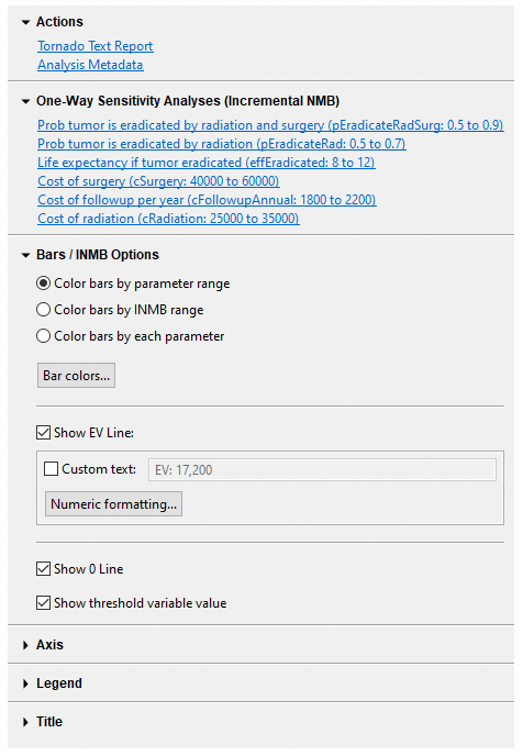
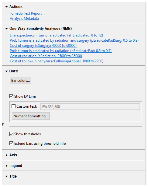
In addition to the main tornado graph, there are additional reports and graph display options to the right of the graph.
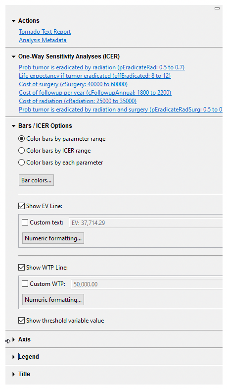
The Tornado Text Report provides a grid of numeric data related to the graph.
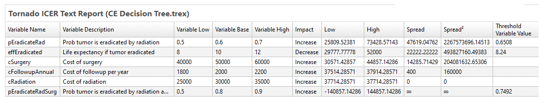
Each input/range is presented as a row in the report along with details on its range, base case, ICER impact, ICER range (low, high, spread) and possibly a threshold value.
The One-Way Sensitivity Analyses links generate a input value vs. ICER line graph for each input. We will examine a few here, starting with the top bar (second input) for the variable pEradicateRad.
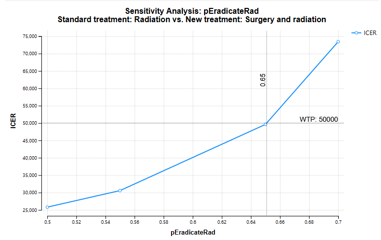
The graph above shows the impact of the individual parameter pEradicateRad on ICER. Note that the ICER increases with pEradicateRad. Also note the CE Threshold at value 0.65.
Remember that the top parameter in the ICER Tornado contained an infinity sign rather than a bar. The One-Way Sensitivity Analysis link for pEradicateRadSug (with the infinity sign) generates the graph below.
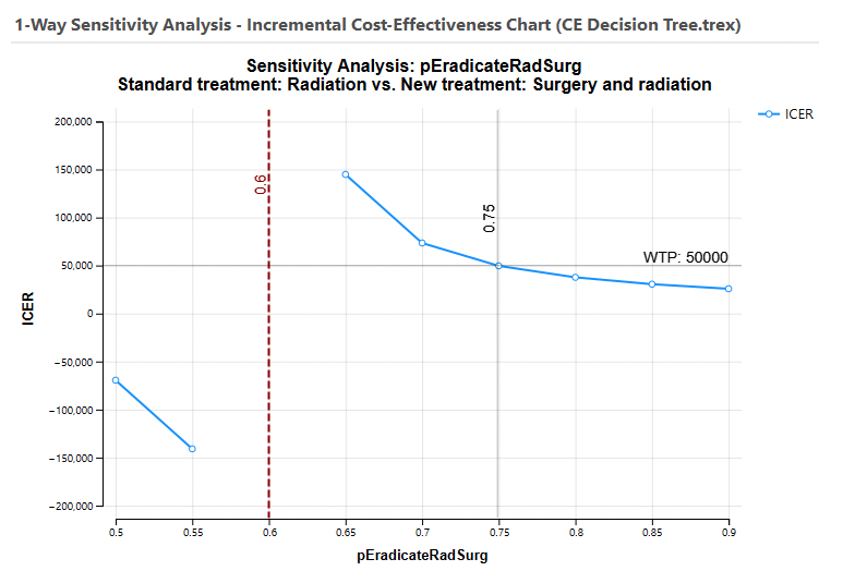
Note that there are no upper and lower bounds on the ICER. As pEradicateRadSurg approaches 0.6, the incremental effectiveness approaches 0, so the ICER becomes undefined. This results in an asymptote at value 0.6 on this graph and an infinity sign on the ICER Tornado graph.
Graph display options are also available in the right-hand pane to the right of the ICER Tornado diagram. These control the graph's display of bars, EV/WTP lines, thresholds and the legend.
CE INMB Tornado Graph
Click on the Incremental NMB Chart button or the Incremental NMB... link to open the CE INMB Tornado Graph. You will be prompted for a WTP (default from Tree Prefs). You will also be prompted to choose comparator and baseline strategies. The INMB is calculated as the NMB for the comparator strategy less the NMB for the baseline strategy. Generally you will choose the more cost-effective strategy as the comparator, so the baseline INMB will be positive.
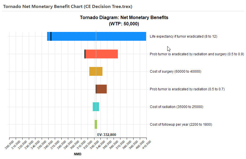
The CE INMB Tornado Graph consists of a set of horizontal bars with each representing the impact on INMB of a specific input variable range.
The widest bars at the top represent input ranges with the largest impact on INMB - starting with "Prob tumor is eradicated by radiation and surgery". Note that in the CE ICER Tornado, the bar could not be drawn because the ICER had an infinite range. With no denominator in INMB calculations, INMB will never have an infinite range.
Each bar is split by the EV line, which represents the base case INMB where every input is at its best estimated value. At baseline values, the "New treatment" is the most cost-effective because the INMB is positive.
For each bar, the blue portion represents the part of the input range from the lower bound to the base case value, while the red portion repreents the part of the input range from the base case value to the upper bound. This allows you to immediately see which inputs increase vs. decrease the INMB.
-
Prob tumor is eradicated by radiation and surgery - increase in input (0.5-0.9) causes increase in INMB.
-
Prob tumor is eradicated by radiation - decrease in input (0.7-0.5) causes increase in INMB.
The INMB value of 0 represents the point where the strategies have equal NMB values. Any bar that passes through the 0 point contains a cost-effectiveness threshold. The top three bars all have CE thresholds, and the threshold input value is displayed on the graph by default.
In addition to the main tornado graph, there are additional reports and graph display options to the right of the graph.
The Tornado Text Report provides a grid of numeric data related to the graph.
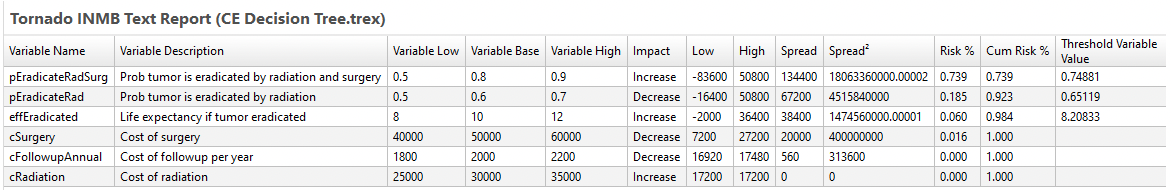
Each input/range is presented as a row in the report along with details on its range, base case, INMB impact, INMB range and possibly a threshold value.
The One-Way Sensitivity Analyses links generate a input value vs. INMB line graph for each input. We will examine the top one here for variable pEradicateRadSurg.
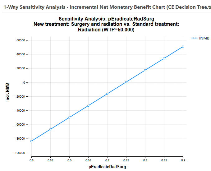
The graph above shows the impact of the individual parameter pEradicateRadSurg on INMB. Note that the INMB increases with pEradicateRad. There is an implied threshold at about 0.75 where the INMB passes through 0.
Graph display options are also available in the right-hand pane to the right of the INMB Tornado diagram. These control the graph's display of bars, EV/WTP lines, thresholds and the legend.
CE NMB Tornado Diagram
Click on the Incremental NMB... link to open the CE NMB Tornado Graph. You will be prompted for a WTP (default from Tree Prefs). You will also be prompted to choose between showing all strategies or a single strategy. Generally, you will choose all strategies.
The CE INMB Tornado Graph consists of a set of horizontal bars with each representing the impact on NMB of the most cost-effective strategy of a specific input variable range. However, the width of the bars is not particularly relevant as there may have been a change in optimal strategy within the input range.
The dark vertical line within the bar indicates a cost-effectivness threshold (bars 1, 2, 4). This graph cannot provide good visibility into the impact of that threshold, but the text report and the one-way graphs for each input do provide visibility.
The Tornado Text Report provides a grid of numeric data related to the graph.
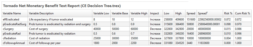
Each input/range is presented as a row in the report along with details on its range, base case, NMB impact and NMB range. Thresholds are not included in this report, but you can get them with the individual input graphs described below.
The One-Way Sensitivity Analyses links generate a input value vs. NMB line graph for each input. We will examine the top one here for variable effEradicated.
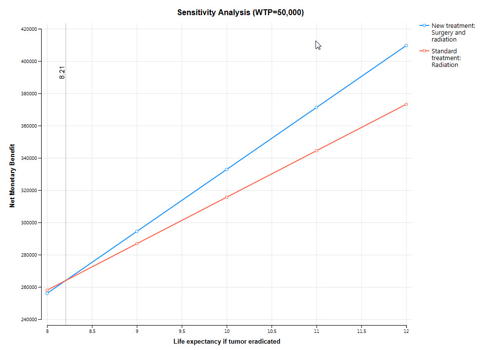
The graph above shows the impact of the individual parameter effEradicated on NMB for all strategies. Note that the NMB increases for both strategies. There is an explicit CE threshold at about 8.21 where the strategy with the highest NMB changes from Standard treatment to New treatment.
Graph display options are also available in the right-hand pane to the right of the NMB Tornado diagram. These control the graph's display of bars, EV/WTP lines, thresholds and the legend.
CE Cost Tornado Diagram
Click on the Cost... link to open the CE Cost Tornado Graph. You will be prompted to choose between showing all strategies or a single strategy.
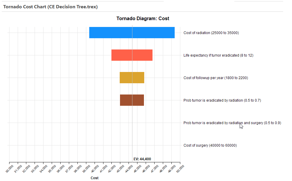
The graph above is for all strategies. Since the lowest cost strategy is "Standard treatment" across all input ranges, only the cost of that strategy is shown. Had there been an input range where the least costly strategy changed, there would be a threshold shown as in the CE NMB Tornado.
Secondary links show the impact on cost for each input range.
CE Incremental Cost Tornado Diagram
Click on the Incremental Cost... link to open the CE Incremental Cost Tornado Graph. You will be prompted to choose a comparator and baseline strategies. The Incremental Cost (IC) is calculated as the Cost for the comparator strategy less the Cost for the baseline strategy. Generally you will choose the more costly strategy as the comparator, so the baseline IC will be positive.
The CE IC Tornado Graph consists of a set of horizontal bars with each representing the impact on IC of a specific input variable range.
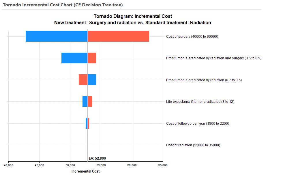
Similar to prior graphs, there is an EV line for the baseline IC. Each bar shows the change in IC over the input range. The blue portion of the bar represents the lower part of the input range while the red portion of the bar represents the upper part of the range.
Secondary links show the impact on IC for each input range.
CE Effectiveness Tornado Diagram
Click on the Effectiveness... link to open the CE Effectiveness Tornado Graph. You will be prompted to choose between showing all strategies or a single strategy.
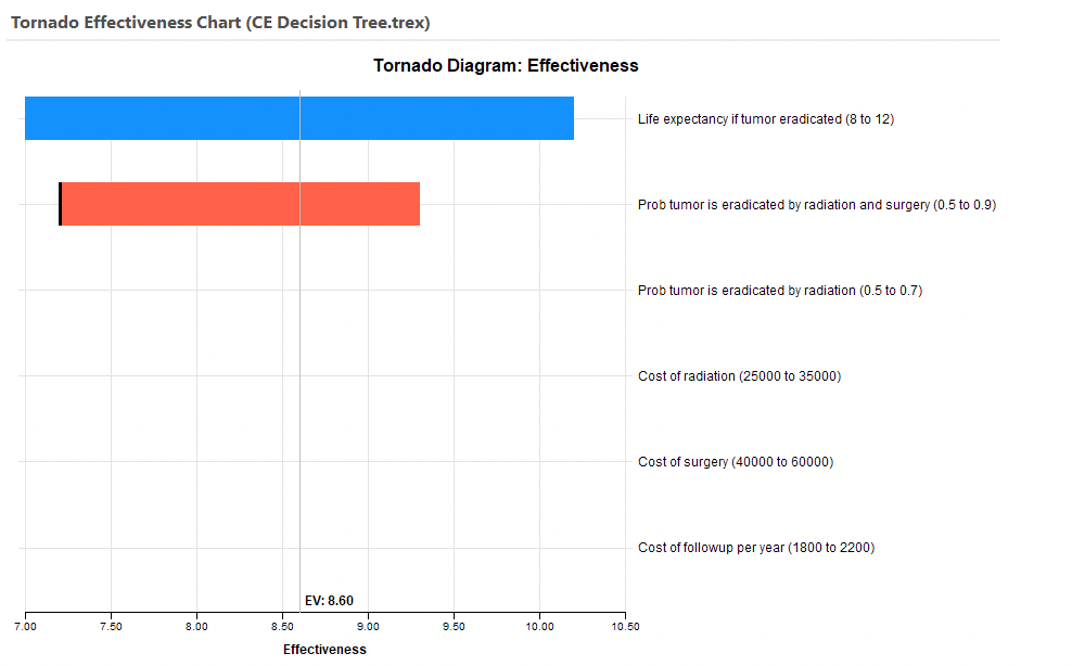
The graph above was for all strategies. For most of the ranges the highest Effectiveness strategy is "New treatment" across all input ranges. However, the second bar includes a dark vertical line which indicates a threshold where there is a change to the "Standard treatment" being the most effective treatment.
Secondary links show the impact on cost for each input range.
CE Incremental Effectiveness Tornado Diagram
Click on the Incremental Effectiveness... link to open the CE Incremental Effectiveness Tornado Graph. You will be prompted to choose a comparator and baseline strategies. The Incremental Effectiveness (IE) is calculated as the Effectiveness for the comparator strategy less the Effectiveness for the baseline strategy. Generally you will choose the more effective strategy as the comparator, so the baseline IC will be positive.
The CE IE Tornado Graph consists of a set of horizontal bars with each representing the impact on IE of a specific input variable range.
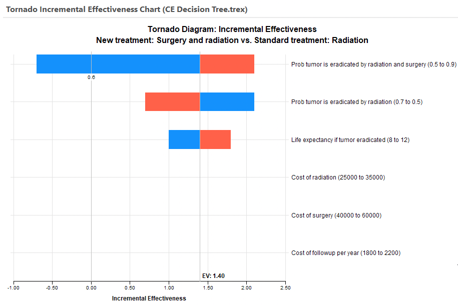
Similar to prior graphs, there is an EV line for the baseline IE. Each bar shows the change in IE over the input range. The blue portion of the bar represents the lower part of the input range while the red portion of the bar represents the upper part of the range. Note the threshold for the top bar at pEradicatedRadSurg value of 0.6.
Secondary links show the impact on IC for each input range.