32.7 CEA Outputs
Cost-Effectiveness Reports
CE simulations provides three cost-effectiveness graphs, accessible under CE Outputs grouping.
-
CE Graph: Standard cost-effectiveness graph.
-
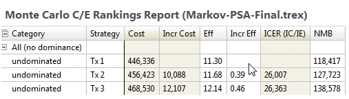
CE Rankings: CE text report.
The Monte Carlo simulation CE Graph is the same graph type as is generated by the Analysis > Cost-Effectiveness menu command. However, in a PSA simulation, this graph plots the average values from all model calculations. The graph includes the standard CEA graph and report format.
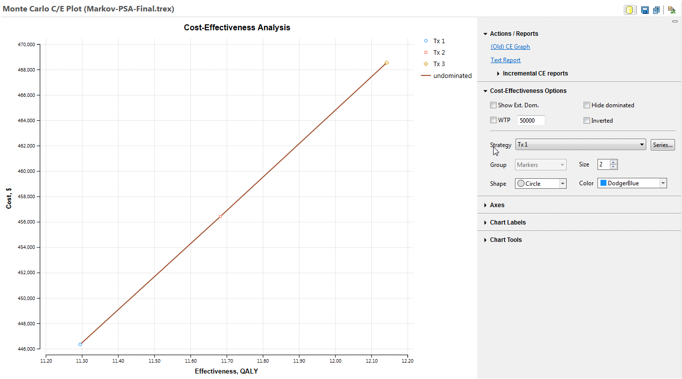
See the sections Building and Analysing Cost Effectiveness Models for detailed descriptions of the cost-effectiveness graph and text report.
The CE Rankings Report option generates a ranked version of the CEA text report.
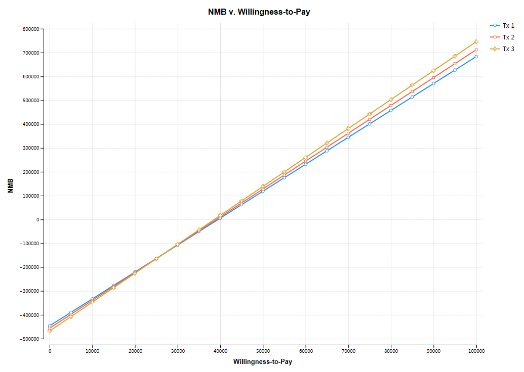
Net Benefits vs. WTP
Net monetary benefits (NMB) calculations integrate a particular WTP value and will prompt you to provide a WTP value range. The Net Benefits vs. WTP graph, in both average and incremental formats, functions as a sensitivity analysis on WTP.
An intervention’s mean effectiveness and cost statistics for the simulation are the only other inputs for each calculation of that intervention’s net benefit.
Incremental Net Benefits vs. WTP
To graph incremental net benefit curves for any combination of two strategies, click on the link for INMB v. WTP. This will present you options to select the pair of strategies for which you want to generate the INMB for.
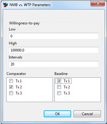
When you have selected the strategies, click OK and the INMB vs Willingness-to-pay graph will be displayed.
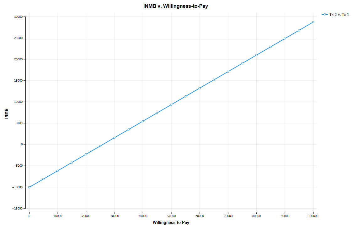
Incremental net monetary benefit (INMB) is calculated as:
where C refers to a comparator and B refers to the baseline. An alternative form of the equation, providing the same result, is:

Note that the incremental net benefits graph above shows that INMB is zero at about WTP = 26,000. This threshold is also reflected in the Net Benefits vs. WTP graph further above with the crossing of the two strategies' curves. That is also the ICER shown in the Rankings report.