32.5 PSA Outputs
The PSA Outputs group presents the primary outputs used to interpret PSA results. Each of the following reports is discussed in a subsection below:
-
Acceptability Curve
-
CE Scatterplot
-
ICE Scatterplot
-
ICER Histogram
-
Acceptability Curve at WTP (Strategy Selection)
-
EVPI\EVPPI Summary Reports
32.5.1 Acceptability Curve
The Acceptability Curve is a commonly-used visual aid for communicating the results of probabilistic sensitivity analysis in cost-effectiveness models.
TreeAge Pro's Acceptability Curve presents the percentage of model calculations that favor each strategy across a WTP range. For each WTP value, NMB is calculated for each strategy, and the percentage of calculations where each strategy has the highest NMB is presented in the graph. As WTP increases, the percentages will increase for more effective strategies.
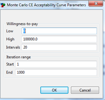
To generate the Acceptability Curve:
-
Click on the link PSA Outputs > Acceptability Curve.
-
Enter the WTP range.
-
Enter the number of WTP intervals.
-
Choose the number of model calculations to use. Typically, you should use all.
-
Click OK.
The Acceptability Curve includes a line series for each strategy, with the values summing to 100% at each interval.
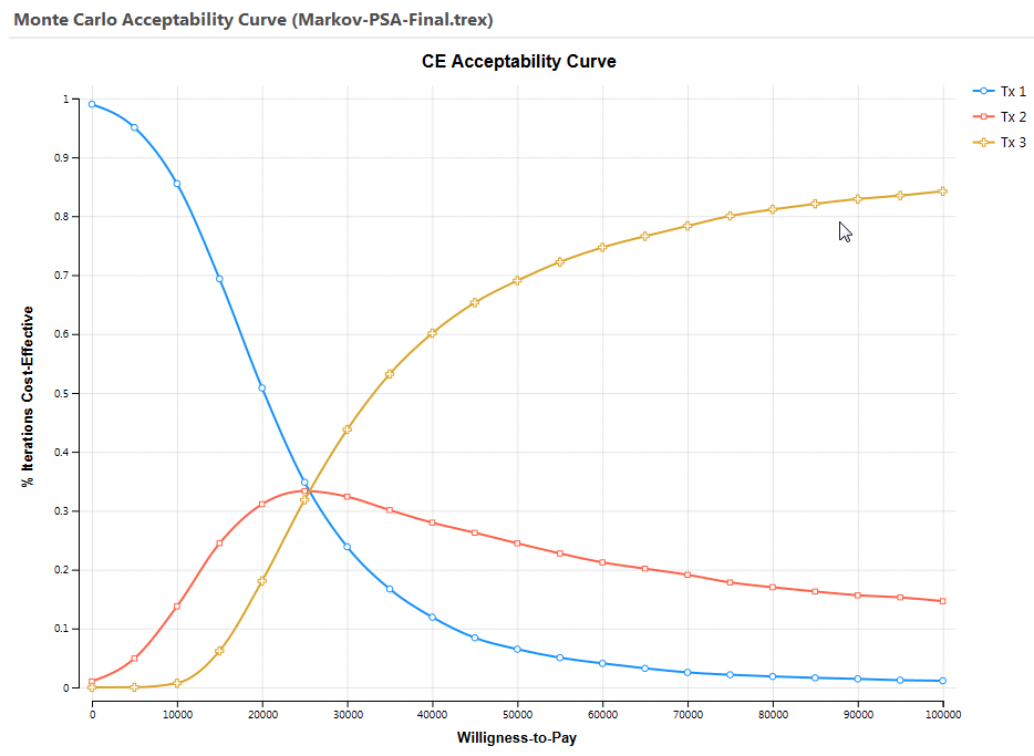
The value of a comparator at WTP=0 represents the probability that each strategy is the least costly option. As the WTP increases, the value of effectiveness increases relative to cost, so more effective strategies are more frequently most cost-effective.
For more information on the net benefits acceptability curve, refer to "Quantifying stochastic uncertainty" Glick, Briggs, and Polsky, Expert Rev Pharmacoeconomic Out Res 1(1), 25-36 (2001) [and www. future-drugs.com].
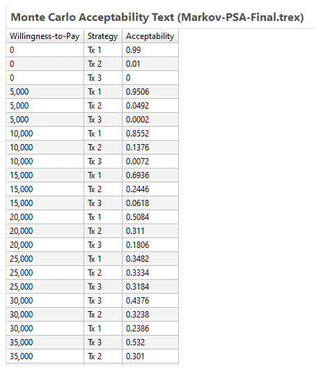
The Acceptability Curve's Text Report provides the numerical data for each option's probabilities at each WTP interval.
32.5.2 CE Scatterplot
The base case CE graph plots the mean cost and mean effectiveness of each strategy, and it can be naturally extended to a scatterplot for the simulation of multiple model calculations. The CE Scatterplot uses the same cost-effectiveness plane to plot the individual cost and effectiveness pairs for each recalculation of the model. If the simulation is performed at a decision node, each strategy’s set of points uses a different color.
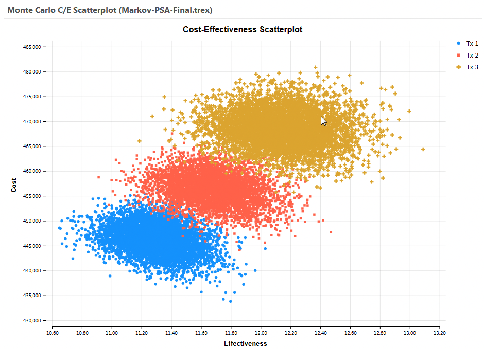
The scatter of points above shows that parameter uncertainty is impacting both the average cost and the average effectiveness of each strategy.
32.5.3 ICE Scatterplot
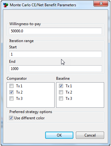
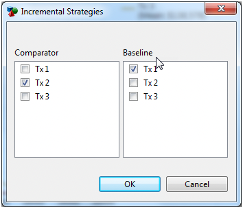
The ICE Scatterplot examines the incremental cost and incremental effectiveness between any pair of strategies. You pick a comparator and baseline strategy for the graph, and the incremental values are calculated as comparator - baseline. Those incremental values are then plotted for every model calculation. We recommend that you choose the more expensive strategy as the comparator to generate mostly positive incremental values, which are easier to interpret.
When you select the ICE Scatter, the Monte Carlo CE/Net Benefit Parameters dialogue below will open. It will allow you to choose the WTP and number of iterations, and the strategy pairing you require. By default, calculations that favor the comparator strategy will be green dots and calculations that favor the baseline strategy will be red. Uncheck the Preferred strategy options: "Use different color" box to use a single color.
Each point in the graph represents a single model calculation by plotting the incremental cost (x-value) and incremental effectiveness (y-value).
The WTP, or ICER threshold, is represented by a line intersecting the origin of the plot. The slope of the line is the WTP - splitting the graph into points that favor the comparator strategy (below/right of line) and those that favor the baseline strategy (above/left of line).
The resulting ICE Scatterplot for Tx2 vs. Tx1 is presented below. Note the ellipsis showing the 95% confidence interval. The model calculations which favour Tx2 are shown in green, whilst those model calculations which favour the Tx1 strategy are shown in red.

The graph above shows that the Tx2 strategy (relative to Tx1) is more cost-effective around 72% of the time given a WTP of 50,000.
For details on how confidence ellipses account for correlation between cost and effects, see “Reflecting Uncertainty in Cost-Effectiveness Analysis”, Manning et al, Ch. 8 in Cost-Effectiveness in Health and Medicine, Gold et al., Oxford Univ. Press (1996).
You can customize the ICE scatterplot after it is generated using techniques described in the Customizing scatterplot graphs section of the Graphs section. Customizations include:
-
Changing the WTP.
-
Changing/hiding the confidence interval elipse.
-
Changing the scale for the axis.
-
Changing the marker type and/or size.
-
Filtering the number of scatterplot points.
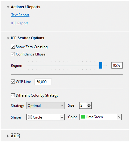
To see the number of points in each region of the graph, you can open the ICE Report via the link to the right of the graph. The figure below relates each component of the ICE Report to its plot area within the ICE Scatterplot graph. Note that the first 3 components favor the comparator strategy, and the last 3 favor the baseline strategy.
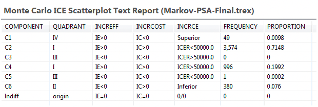
This summary can be interpreted to indicate the number of iterations that recommend the comparator strategy over the baseline strategy as follows:
-
C1 - Comparator is less costly and more effective. Comparator is recommended because it absolutely dominates baseline.
-
C2 - Comparator is more costly and more effective. Comparator is recommended because the ICER does not exceed the WTP.
-
C3 - Comparator is less costly and less effective. Comparator is recommended because the ICER does not exceed the WTP.
-
C4 - Comparator is more costly and more effective. Comparator is not recommended because the ICER exceeds the WTP.
-
C5 - Comparator is less costly and less effective. Comparator is not recommended because the ICER exceeds the WTP.
-
C6 - Comparator is more costly and less effective. Comparator is not recommended because it is absolutely dominated by the baseline.
Increasing the WTP value changes the slope of the WTP line, the shape of the component regions #2–5, and thus the report. See the section on Acceptability Curves below for a robust method of testing a range of WTP values for all potentially cost-effective strategies.
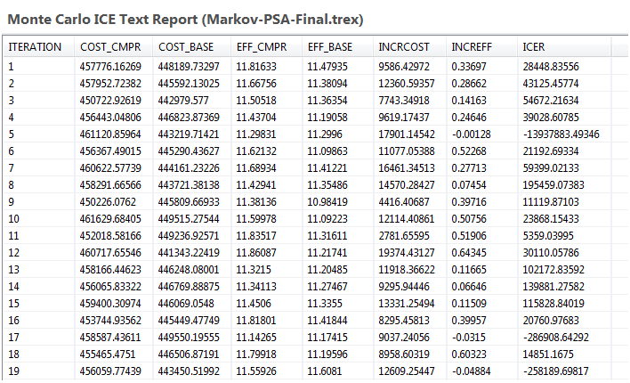
The graph's Text Report shows the IC and IE for each iteration, which becomes the source of the scatterplot. See below.
For additional discussion, refer to "Uncertainty in Decision Models Analyzing Cost-Effectiveness," Maria Hunink et al, Medical Decision Making 18:337-346 (1998).
32.5.4 ICER Histograms
These histogram graphs plot the distribution of ICERs for a pair of strategies.
When you select the ICER histograms, a dialogue will open and prompt you to select a pair of strategies. This graph allows you to examine the effect of uncertainty on ICER. We recommend selecting a pair with the more expensive strategy vs. the less expensive strategy.
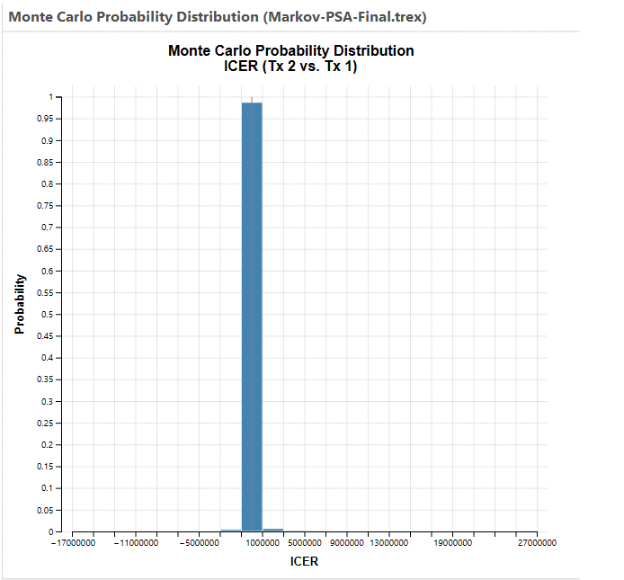
This graph is has an enormous range because the incremental effectiveness is close to zero creating huge variance within the ICER calculations. However, the ICER mean and prediction interval data are derived from INMB statistics rather that raw ICER statistics with methods published by Hatswell et al. This method is used because it produces more robust statistics since ICER is a ratio of model outputs. This avoids overstating ICER instability in cases where the denominator IE is close to or crosses 0.
The difference between the INMB-derived statistics and the raw ICER statistics can be seen in the ICER histogram Stats Report.
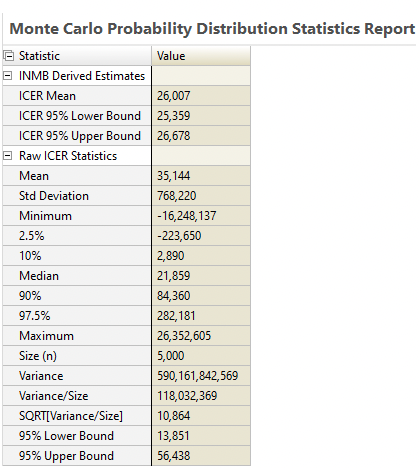
This results in a more reasonable and accurate prediction interval that is not unduly affected by IE values near 0.
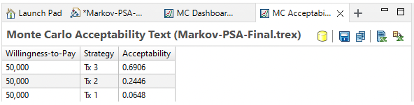
32.5.5 Acceptability at WTP
The Acceptability at WTP option shows the percentage of iterations that favor each strategy based on net benefits calculations at a specific willingness to pay value (rather than a range).
32.5.6 EVPI\EVPPI Summary Report and EVPI vs. WTP report
The EVPI\EVPPI Summary Report and EVPI vs. WTP report and discussed a separate section later in this chapter. Please follow this link to the section EVPPI Simulation on CE Models.