7.2 Performing Cost-Effectiveness Analysis (CEA)
TreeAge Pro’s cost-effectiveness (CE) graphs, and the text report underlying it, are the fundamental tools for cost-effectiveness analysis of your decision trees. They display the key information from the analysis, including incremental values and conditions of dominance.
Using the Get Started Example model CE Decision Tree we will examine the CEA reporting.
To generate a CE graph:
-
Select the decision node.
-
Choose Analysis > Cost-Effectiveness… from the menu.
-
If you are in the Analysis perspective, you can also select the icon to run the CEA Graph.

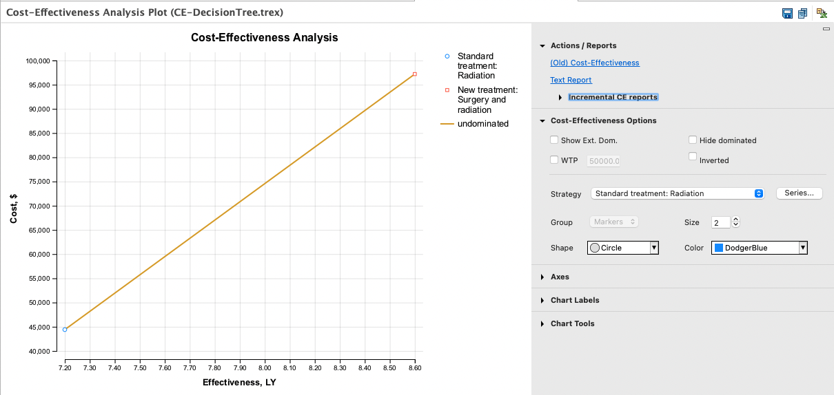
The optimal strategy from the cost-effectiveness frontier can be identified checking the WTP box in the Cost-Effectiveness Options, on the right-hand side of the graph.

There are several considerations when interpreting the results of the cost-effectiveness analysis graph. We will talk about this next, with some more detailed information in later sections.
The model we are considering has two strategies which are not dominated (in this case) and will be connected by line segments which form the cost-effective frontier. Only the strategies on the cost-effective frontier could be the optimal choice, regardless of the Willingness to Pay (WTP) value. The lowest cost option is always part of this frontier; if it dominates all comparators, the graph will have no lines.
In the graph above, the WTP line passes through the optimal strategy for the WTP value of 50,000. The slope of the cost-effectiveness frontier represents the Incremental Cost Effectiveness Ratio (ICER) between any two strategies. In this model, the slope of the ICER line is less than the slope of the WTP line, that is the ICER is less than the WTP, making the Biopsy strategy the most cost-effective.
If you have more than two strategies, there are rules used to determine which options are excluded from the cost-effective frontier. Look to the section Identifying the Optimal Strategy for more details.
You can change the graph x-y orientation of cost and effectiveness via the Tree Preference category C/E Parameters.
The CE Analysis report
To see the calculated values underlying the CE graph, open the graph’s text report which is in the Actions/Report link to the right-hand side of the graph.

The Text Report for this model shows the undominated strategies. If the model had strategies which were undominated and strategies which were dominated, these would be listed in two collapsible groupings.
The Net Monetary Benefits (NMB) is calculated using the WTP parameter from the Tree Preferences. The optimal strategy will have the largest NMB value given that WTP value.
Incremental Cost-Effectiveness Graph
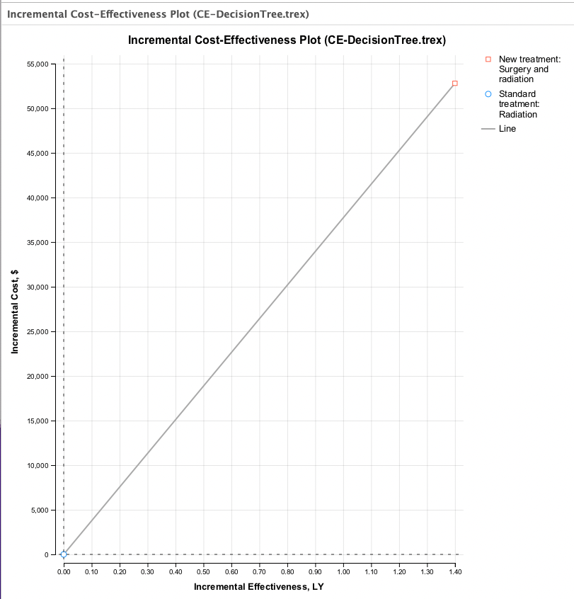
You can examine a pair of strategies by generating an Incremental Cost-Effectiveness Graph. Incremental graphs require a pair of strategies. To open an Incremental CE report: Actions/Reports > Incremental CE reports, then choose a pair of strategies based on the appropriate ordering of the strategies.
An Incremental Cost-Effectiveness Graph shows one comparator strategy's incremental cost and incremental effectiveness values relative to a baseline strategy. The graph below was generated by choorsing the link for New Treatment 2 vs. Standard Treatment.

The New Treatment strategy is both more costly and more effective than the Standard Treatment strategy so the New Treatment comparator strategy is presented above and to the right of the Standard Treatment comparator strategy. The relative position of the strategies is described in more detail in the next section describing dominance.
